Project Overview
HINO Trucks needed a corporate website for the US market that fully aligned with its global brand standards while standing on its own as a confident, modern digital product. The project was delivered remotely with a multidisciplinary team of designers, developers, strategists, copywriters and creative directors. My role focused on UI design — translating brand guidelines and web standards into a clear, functional and consistent experience across the platform.
Creative Challenge
The existing presence was fragmented across regional templates and legacy patterns, which made the brand read as inconsistent and dated next to its international competitors. The team needed a unified UI language that could carry dense product information — truck lineups, specs, dealer tools and corporate content — without losing the precision and credibility expected from a global manufacturer. The challenge was to honour strict brand standards while delivering a scalable interface system the in-house team could grow over time.
Design Solution
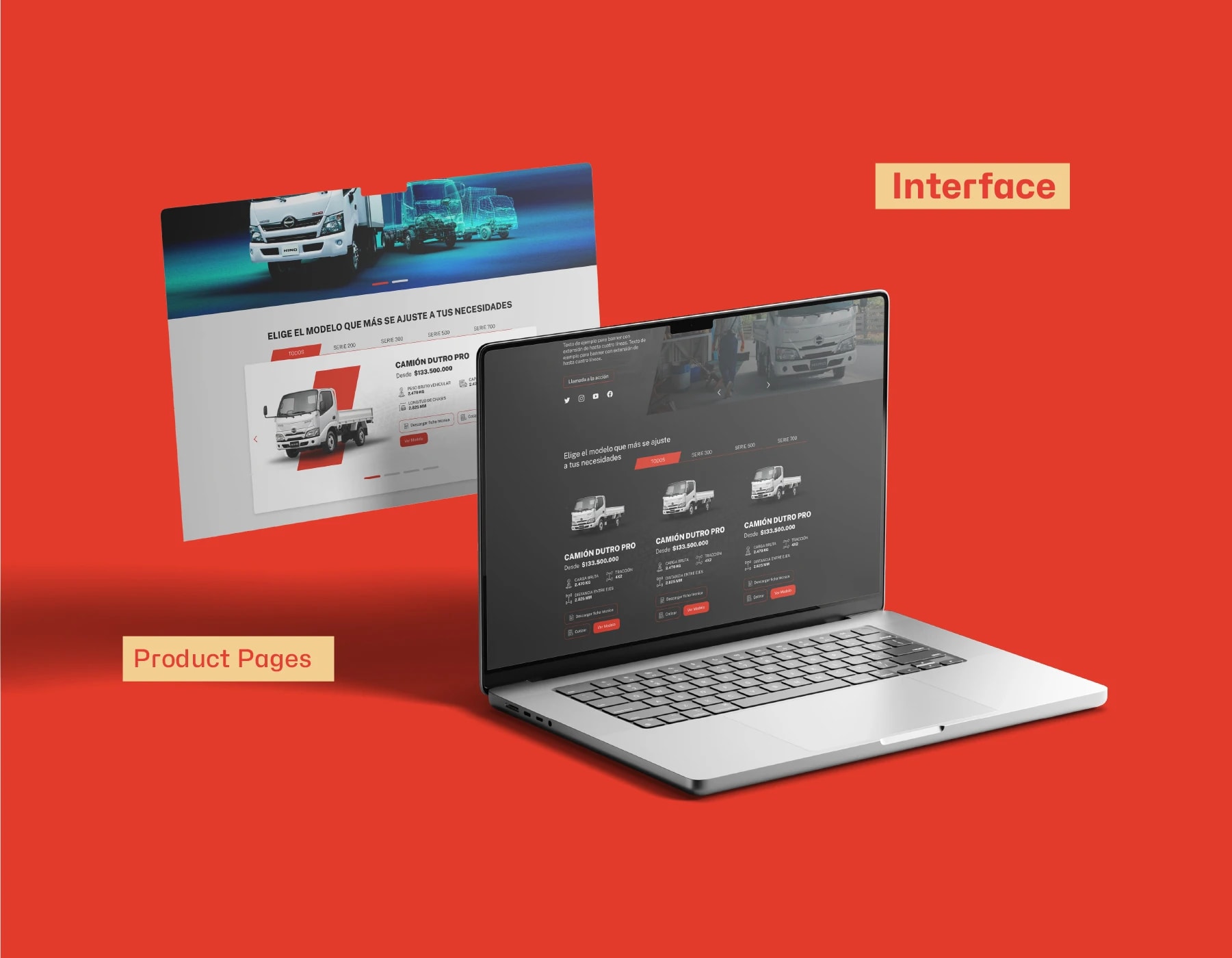
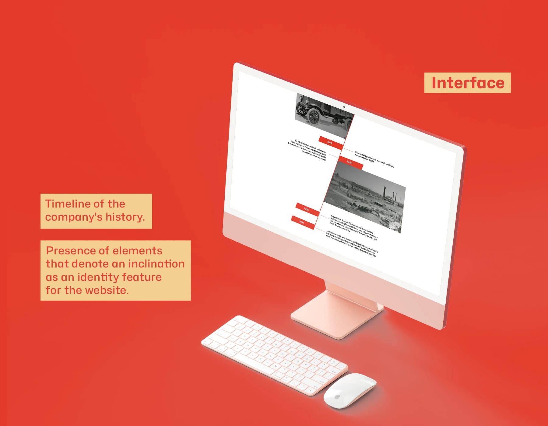
The interface is built on a strict grid, a strong typographic hierarchy and a restrained corporate palette that lets product imagery lead. Navigation, product pages and dealer flows share the same modular blocks, so editorial content, vehicle configurators and support sections feel like one product rather than separate sites. The system is fully responsive — desktop, tablet and mobile share the same building blocks, retuned for each breakpoint — and ships with documented patterns the internal team can extend without breaking the brand.
Results & Impact
The final platform launched as a scalable, professional foundation for HINO in the US: a clearer brand voice, faster paths from landing to dealer, and a UI system the internal team can keep evolving. Stakeholders signed off on a single source of truth for components and brand application, and the remote, cross-disciplinary workflow became a reference model for subsequent regional rollouts.
Process Insights
We ran the engagement in Figma with weekly remote ceremonies, combining Agile sprints with Lean and Six Sigma practices to keep scope, quality and communication tight. Strategy and copy were paired with UI exploration from day one, so wireframes, content and visual decisions matured together instead of in sequence. Components, states and responsive rules were defined as a shared library, reviewed with developers and creative direction in the same room, and validated against the brand guidelines before any screen was signed off.
Tools Used
- Figma
- Adobe Illustrator
- Adobe Photoshop
- Notion
- Jira