Project Overview
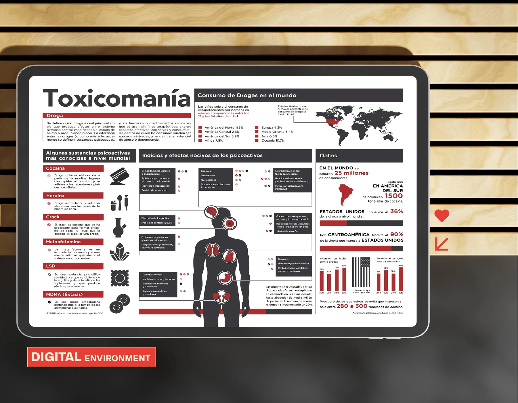
This is an editorial infographic created as an academic project to communicate research about drug use in a clear, structured, and engaging way. The objective was to transform complex information into an intuitive visual experience through effective information design.
Creative Challenge
The project had to present a large volume of research data without overwhelming the reader. The challenge was to establish a clear hierarchy that guided the eye through dense content while maintaining visual interest and readability across the entire composition.
Strategy
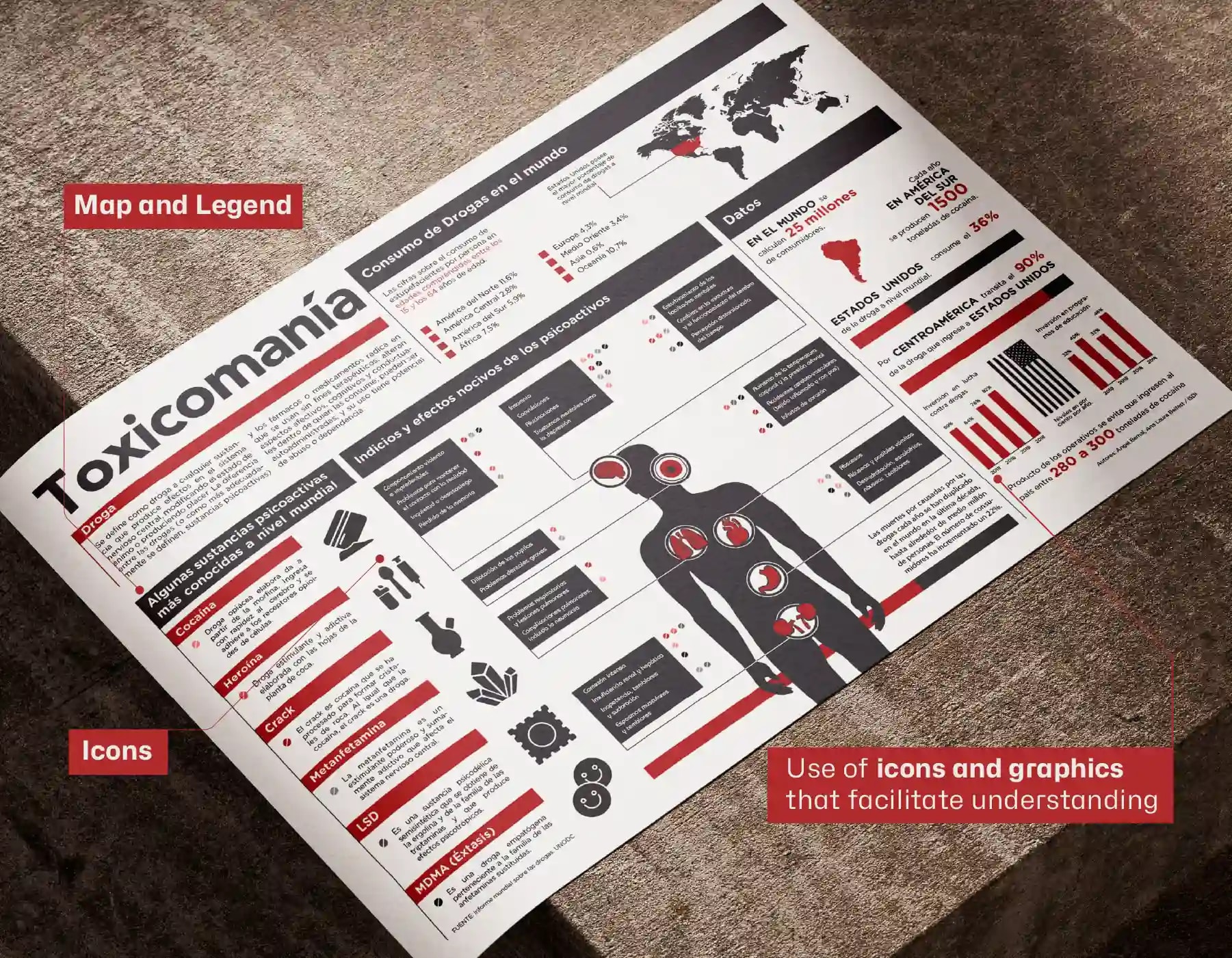
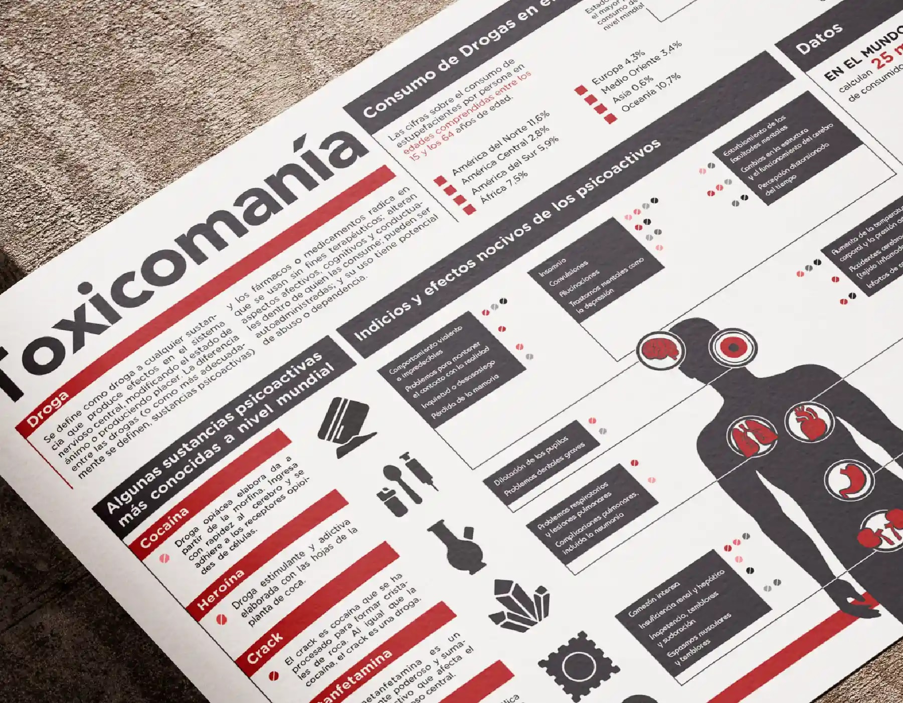
I used a strict grid system to structure the information into digestible sections, establishing a clear typographic hierarchy and data visualization rules. Iconography and color coding were deployed to differentiate topics at a glance and reinforce the reading flow.
Design Solution
The infographic arranges complex data into a balanced editorial layout where typography, icons, charts, and color work together. A modular grid keeps every element in proportion, ensuring that information is accessible without sacrificing visual cohesion.
Results & Impact
The result is a well-structured infographic that improves readability while presenting a large amount of information in a balanced and accessible format. The piece demonstrates strong skills in editorial design, data visualization, and visual communication.
Tools Used
- Adobe Illustrator
- Editorial Design
- Information Design
- Typography
- Data Visualization
- Iconography