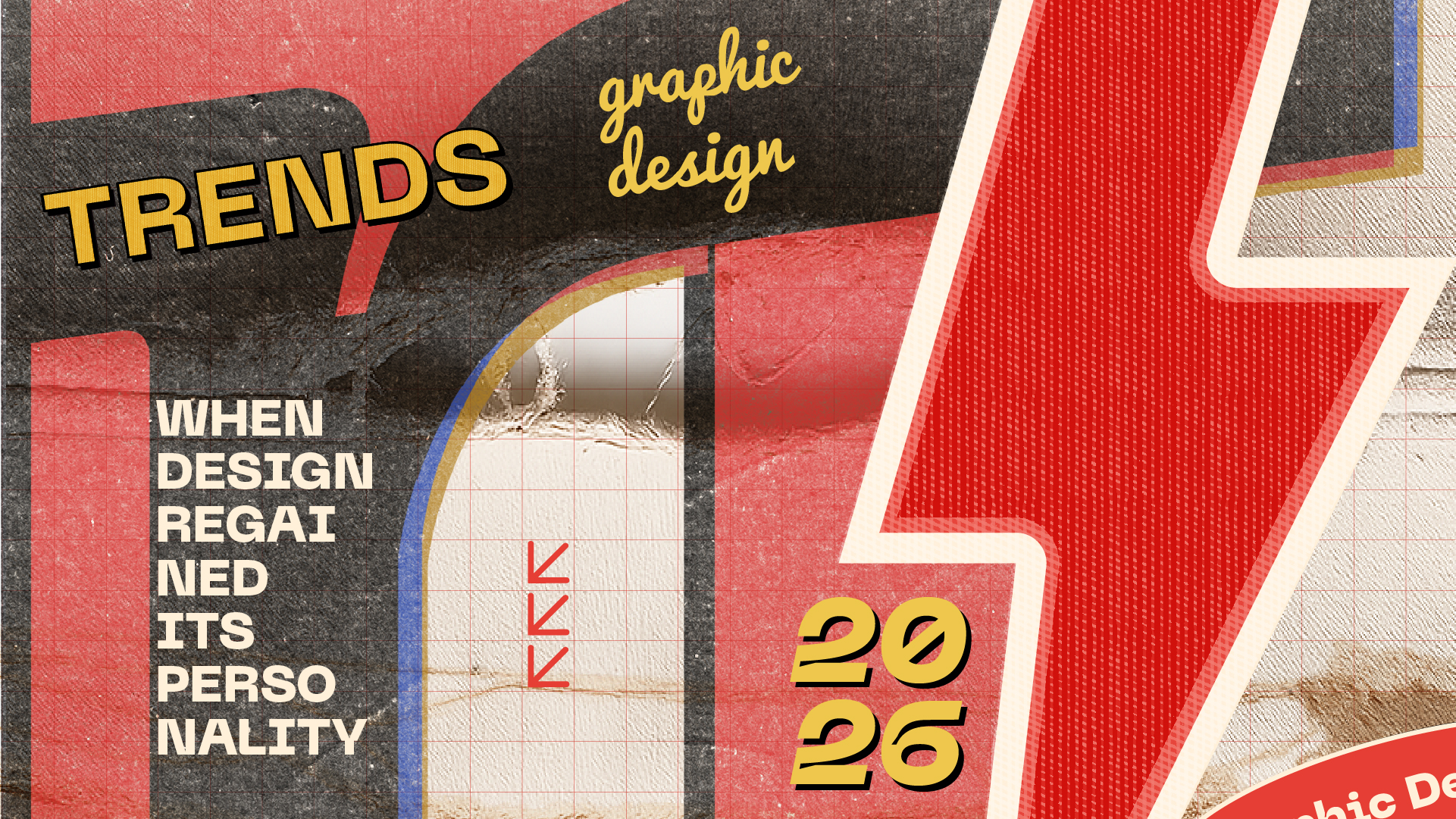
Graphic Design Trends in 2026, when design regained its personality
By Angrafista
Graphic Design Trends in 2026
the design industry in 2026 no longer wants to look perfect. it wants to feel human.
for years, graphic design moved toward the same visual direction: clean interfaces, minimal compositions, geometric logos, and almost clinical visual perfection. then artificial intelligence arrived.
ironically, while AI tools became capable of generating technically perfect visuals in seconds, design itself started reacting in the opposite direction: toward emotion, imperfection, personality, and visual identity.
the graphic design landscape of 2026 is not rejecting technology. it is trying to recover humanity inside it.
"perfection became cheap the moment a machine could produce it. what is rare now is intention."
why perfection started to feel empty
a decade of grids, neutral sans-serifs and pastel gradients trained an entire generation of designers to optimize for legibility above all else. the result was a strange paradox: thousands of brands looking nearly identical, all of them technically correct, none of them memorable.
as soon as generative tools could replicate that aesthetic on demand, the value of "clean" collapsed. perfection stopped being a craft signal and became the default — and in design, anything that becomes the default also becomes invisible.
- Minimalism without meaning began to read as laziness
- "Safe" type pairings stopped earning attention
- Pristine mockups lost their power to persuade
the studios that stand out in 2026 are the ones willing to leave fingerprints on the work.
the return of loud and expressive design
expressive typography is everywhere again. variable fonts are being pushed to their structural limits, display faces are being stretched, condensed, sliced and re-drawn by hand. designers are using type as image, not just as text.
the influence is partly editorial — the spirit of independent magazines, music sleeves and zines — and partly a reaction to algorithmic feeds that flatten everything into the same rectangle. loud design is, more than anything, a survival strategy.
nostalgia as emotional identity
nostalgia is no longer a niche aesthetic, it is a positioning tool. brands borrow from the seventies, the late nineties and the early web because those decades feel honest in a way the algorithmic 2010s do not.
but the smart studios are not copying the past. they are quoting it. a serif headline next to a brutalist grid. a hand-drawn mark on a hyper-modern interface. a film grain over a 3D render. the contrast is the point.
"nostalgia in 2026 is not about looking backwards. it is about borrowing warmth from a time when design felt made by people."
technical aesthetics becoming emotional
code, data and interface visuals are being absorbed into the brand layer. wireframes, terminal type, schematic diagrams and developer-tool aesthetics are showing up on hero sections, posters and packaging.
- Monospaced fonts are being used as primary brand voices
- System UI elements are being staged as editorial illustrations
- Diagrams and annotations replace stock photography
what was once "behind the scenes" is now the front of the brand. it signals craft, transparency and a certain post-AI honesty: this was made, here is how.
why identity matters more than perfection
a brand in 2026 cannot win on polish alone. polish is a commodity. what is scarce is a coherent identity that survives across formats — a website, a label, a stage backdrop, a social asset, a product UI.
identity is not a logo. it is a system of decisions: how the brand sounds, how it moves, how it handles silence and density, what it refuses to do. the studios doing the strongest work this year are treating identity as a long-form argument, not a one-shot deliverable.
the future of human-centered graphic design
the most interesting question of 2026 is not "what can AI generate?" but "what is worth generating at all?"
designers are reclaiming the parts of the practice machines cannot replicate: taste, restraint, conviction, the ability to say no. the toolset has changed. the discipline has not.
"the next decade of design will be measured by intention per pixel, not output per hour."
the trend, if there is one, is this: design is becoming a medium of authorship again.
Top graphic design trends in 2026
A closer look at the ten visual languages defining the year — what they are, where they come from, and why they matter for brands building identity right now.
Experimental typography
Type is no longer a vehicle for the message — type is the message. Variable fonts are pushed to mechanical extremes, custom display faces are drawn for a single campaign, and letterforms are treated as objects rather than alphabets.
The studios leading this wave are using type as architecture: structural, sculptural, occasionally illegible on purpose. Legibility is traded for presence.
Neo-brutalism
Hard borders, raw HTML aesthetics, default system fonts, exposed structure. Neo-brutalism is the visual equivalent of showing the seams — a deliberate rejection of the polished SaaS look that dominated the last decade.
"Neo-brutalism is what happens when designers stop trying to look like Apple and start trying to look like themselves."
It works because it signals confidence. A brand that doesn't need to dress up reads as a brand that knows what it is.
AI-assisted design
Generative tools are now part of the studio stack — but the interesting work is not "AI design", it is design through AI. Moodboards, alternates, texture libraries and rapid iteration are accelerating, while final decisions stay firmly human.
Maximalist editorial layouts
After a decade of single-column, center-aligned hero sections, density is back. Multi-column layouts, overlapping elements, marginalia, footnotes, sidebars and pull quotes are pulled directly from print magazines into web and brand systems.
The reference is independent publishing — Apartamento, The Gentlewoman, Toilet Paper — translated into screens that finally feel like they have something to say.
Retro futurism
The aesthetics of imagined futures from the past — chrome, gradients, vector grids, mid-century space-age type — are being recombined with contemporary craft. Less nostalgia for the past, more nostalgia for the future we were promised.
It pairs unusually well with AI work, because both share a quality of "almost real, slightly wrong" that reads as deliberate when handled with intent.
Grunge digital aesthetics
Scanned textures, photocopied edges, halftone noise, layered film grain, deliberate compression artefacts. Designers are reintroducing imperfection as a counterweight to algorithmically clean output.
This is craft as proof of life: every speck of grain says a human touched this.
Motion identity systems
A logo is no longer a still mark. Identities now ship with motion grammars — how the wordmark enters, how transitions behave, how loading states feel, how a hover responds. Motion is treated as a typographic weight, not a decoration.
"If your brand has a typeface and a colour, it should also have a tempo."
Studios are delivering motion guidelines as part of the basic brand book.
3D mixed with flat design
Pure 3D peaked. Pure flat got boring. The current move is hybrid: flat editorial layouts punctuated by a single hyper-rendered 3D object — a product, a mascot, a symbol — that anchors the composition.
The contrast does the work. The 3D element feels precious because the rest of the page is restrained.
Humanized interfaces
Soft language, imperfect icons, hand-drawn elements inside otherwise rigorous interfaces. Empty states write like a person. Error messages apologise. Buttons have personality without sliding into Memphis-pattern kitsch.
Textured branding systems
Paper stock, fabric, ceramic, printed material, embossing, foil — physical references are pulled into digital brand systems through textured backgrounds, material gradients and tactile UI surfaces.
The point is not to fake print. The point is to remind the viewer that brands exist in the physical world, even when the touchpoint is a screen.
Where this leaves us
Ten trends, one underlying movement: design in 2026 is reclaiming authorship. Tools got faster, output got cheaper, and the only thing left to differentiate work is the who and the why behind it.
The studios that will matter at the end of this year are not the ones chasing every trend on this list. They are the ones picking two or three, executing them with conviction, and refusing the rest.