Project Overview
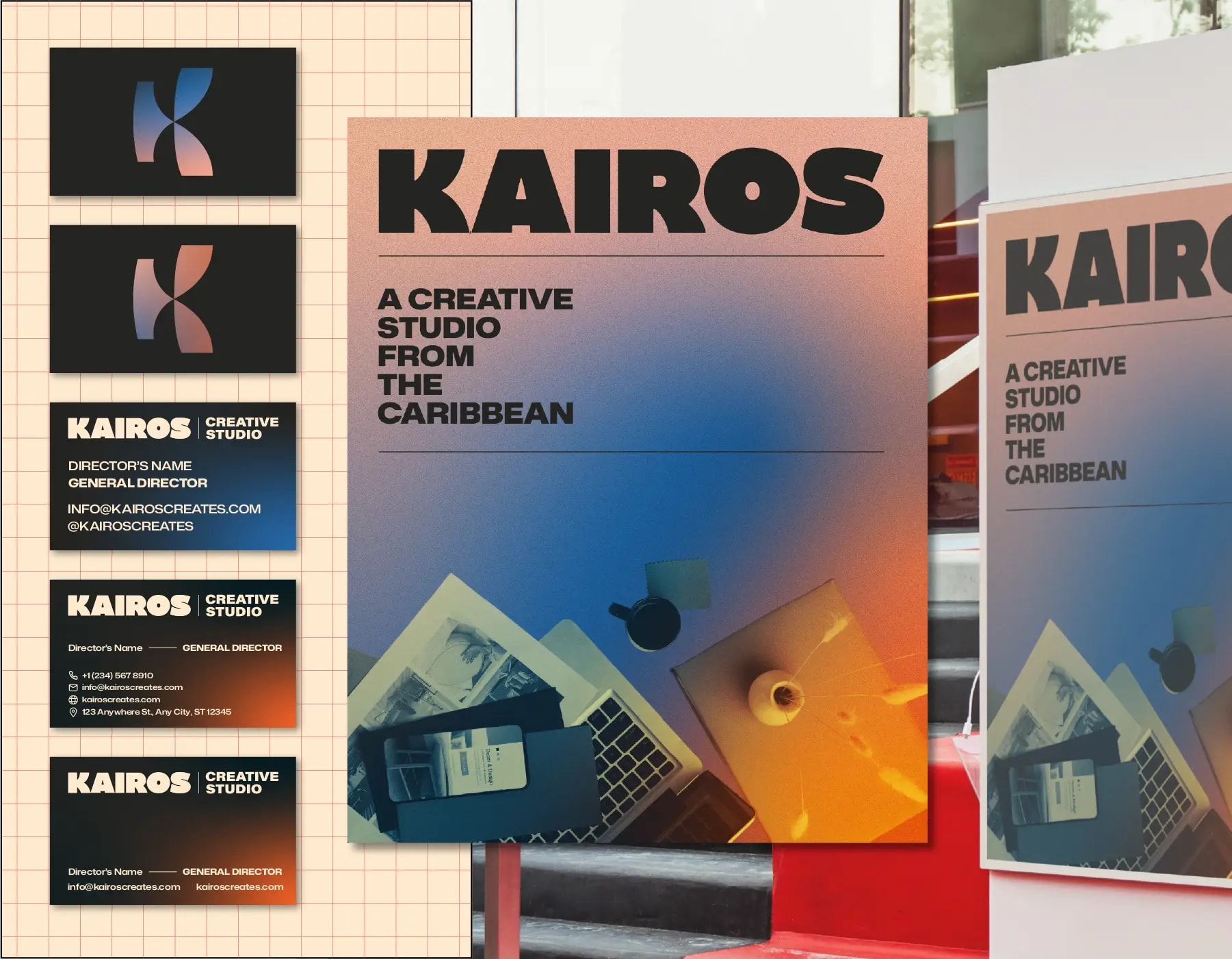
Kairos Creative Studio KY is a Caribbean-based design practice named after the Greek notion of kairos — the decisive, opportune moment to act. The studio engaged us to build the brand from the ground up: a complete visual identity system, a suite of brand applications and a website capable of carrying the practice into international conversations. The engagement was run entirely as a remote collaboration and led, after launch, to my appointment as Senior Lead Designer within the studio.
Creative Challenge
The studio needed an identity that could hold two ideas at once: the discipline of a mature creative partner, and the elasticity of a young practice working across cultures and time zones. Early in the process the founders were being read as just another regional studio — credible locally, but not yet legible to the international clients they wanted to attract. Our brief was to translate the abstract concept of kairos into a visual language that signalled strategic depth without losing the warmth and confidence that defined the team in conversation.
Strategy
We approached the identity as a system of decisions rather than a single mark. Kairos was reframed as a productive tension: structure against abstraction, weight against movement, precision against texture. That tension became the operating logic of every output. We worked in tight, weekly cycles with the founders, prototyping the logotype, color behavior and motion principles in parallel so that brand, applications and website evolved as one coherent argument rather than three separate workstreams.
Design Solution
The visual system is anchored in a bold, heavy custom-tuned wordmark that gives the studio immediate presence at any scale. Around it sits a palette of abstract gradients — read as transformation, momentum and possibility — paired with a tactile grain treatment that grounds the work and gives digital surfaces the feel of printed matter. Photography is unified through a duotone treatment so that any image, regardless of origin, enters the brand on the same terms. Typography, color and texture are governed by a clear hierarchy so the system stays disciplined across decks, social, signage and packaging.
Results & Impact
The website extended the identity into a working argument about the studio. Heavy type carries the narrative, gradients animate between sections to enact the idea of the right moment, and case studies are framed with the same duotone and grain language as the brand applications — collapsing the distance between portfolio and identity. Since launch the studio has been read as a serious international practice, has won engagements outside its original market, and has formalised the design leadership the project surfaced — including my own move into the Senior Lead Designer role inside Kairos.
Tools Used
- Figma
- Adobe Illustrator
- Adobe Photoshop
- After Effects
- Framer