Project Overview
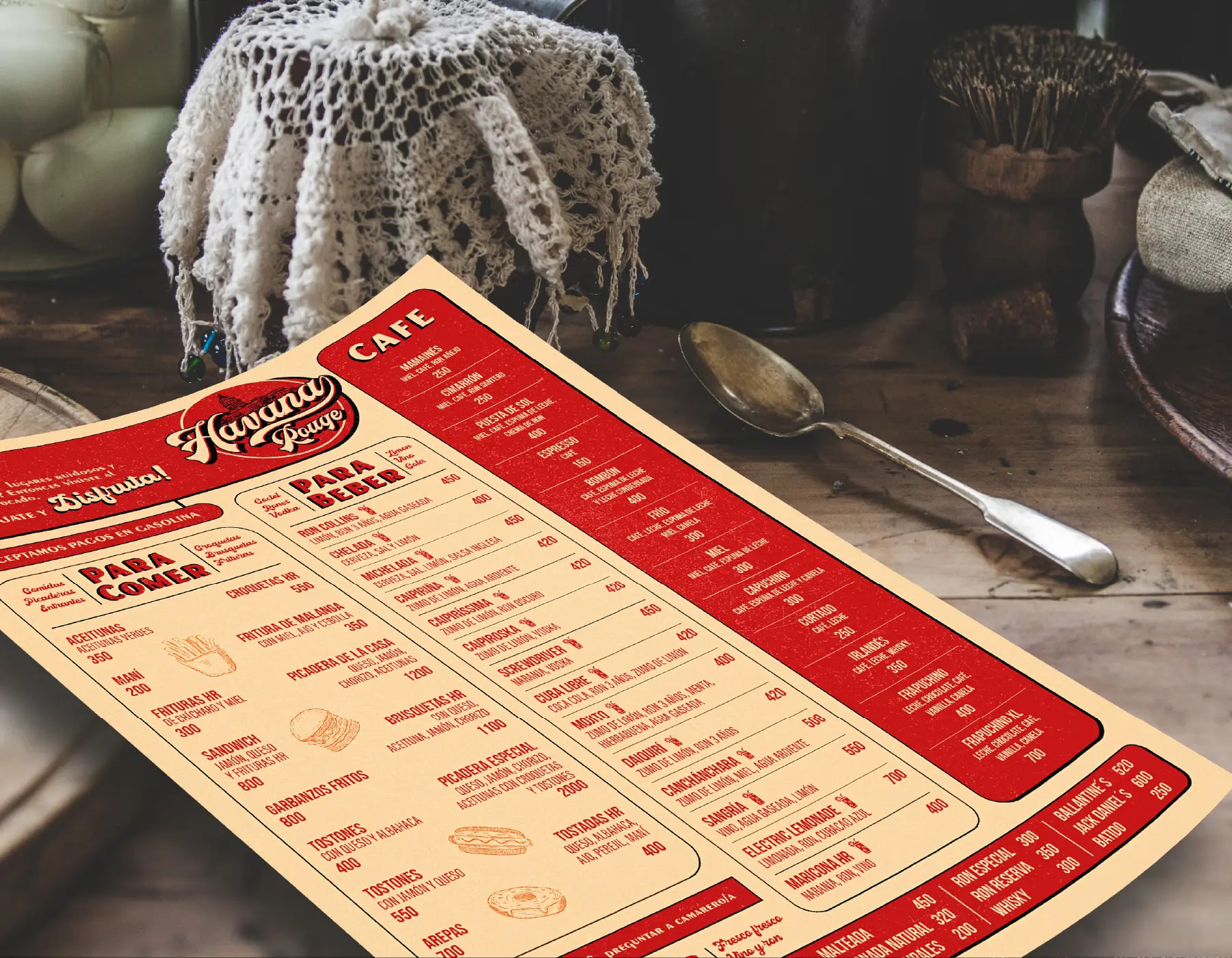
This project focused on the editorial design of the menu for Havana Rouge, extending the restaurant's retro tropical brand identity into one of its most important customer touchpoints. Havana Rouge is a restaurant inspired by the tropical retro aesthetics of 1950s–60s Cuba, reinterpreted with a contemporary, slightly weathered look that evokes nostalgia while appealing to a younger audience. The menu was designed as a physical embodiment of the brand world — a piece that guests would hold, browse, and remember.
Creative Challenge
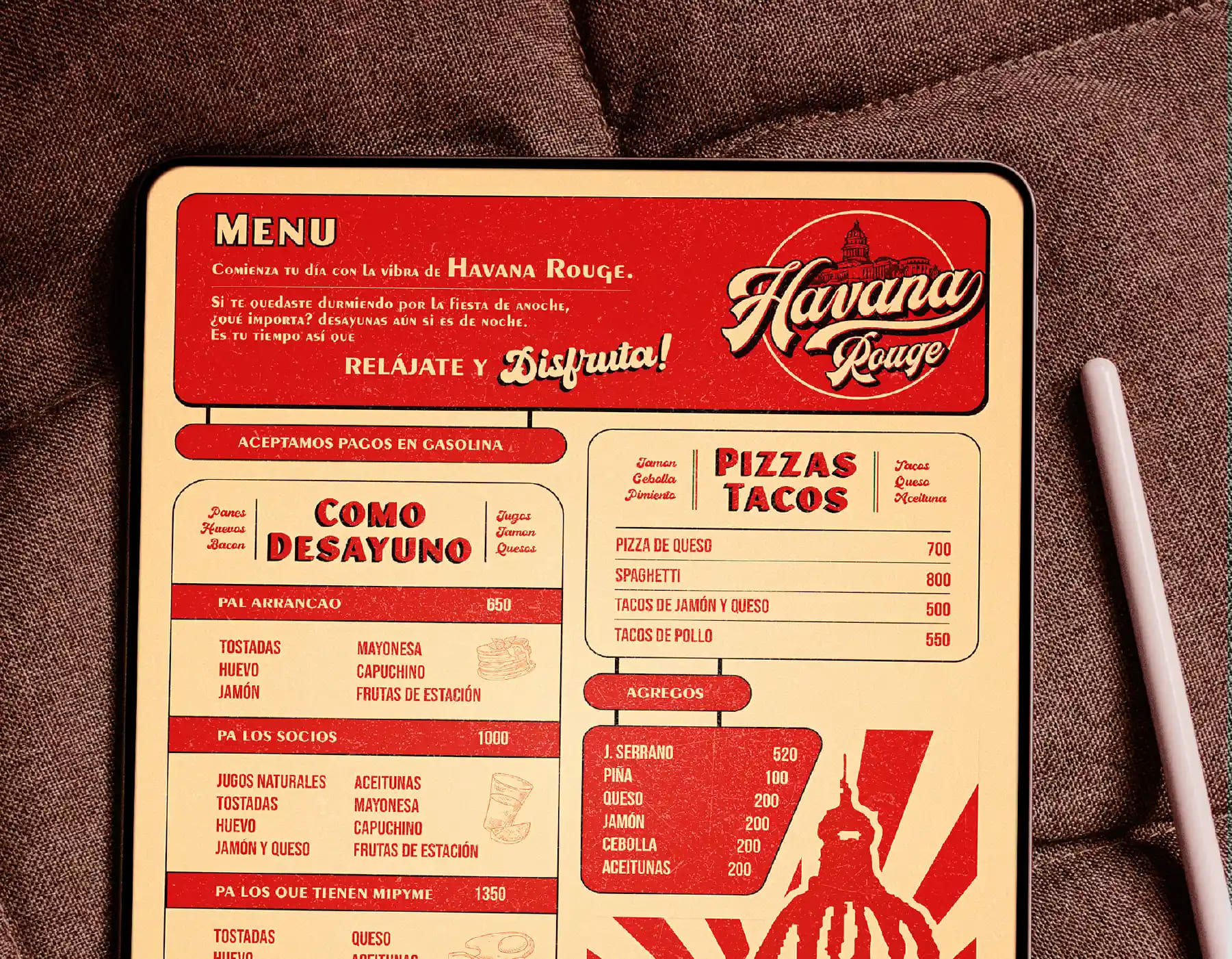
The menu had to do more than list dishes. It needed to immerse diners in the nostalgic atmosphere of 1950s–60s Cuba while remaining perfectly functional as a reading and ordering tool. The challenge was balancing rich atmospheric texture — textures, colors, and graphic details — with the clarity and hierarchy required for a practical restaurant menu. Every page had to feel evocative yet effortless to navigate.
Strategy
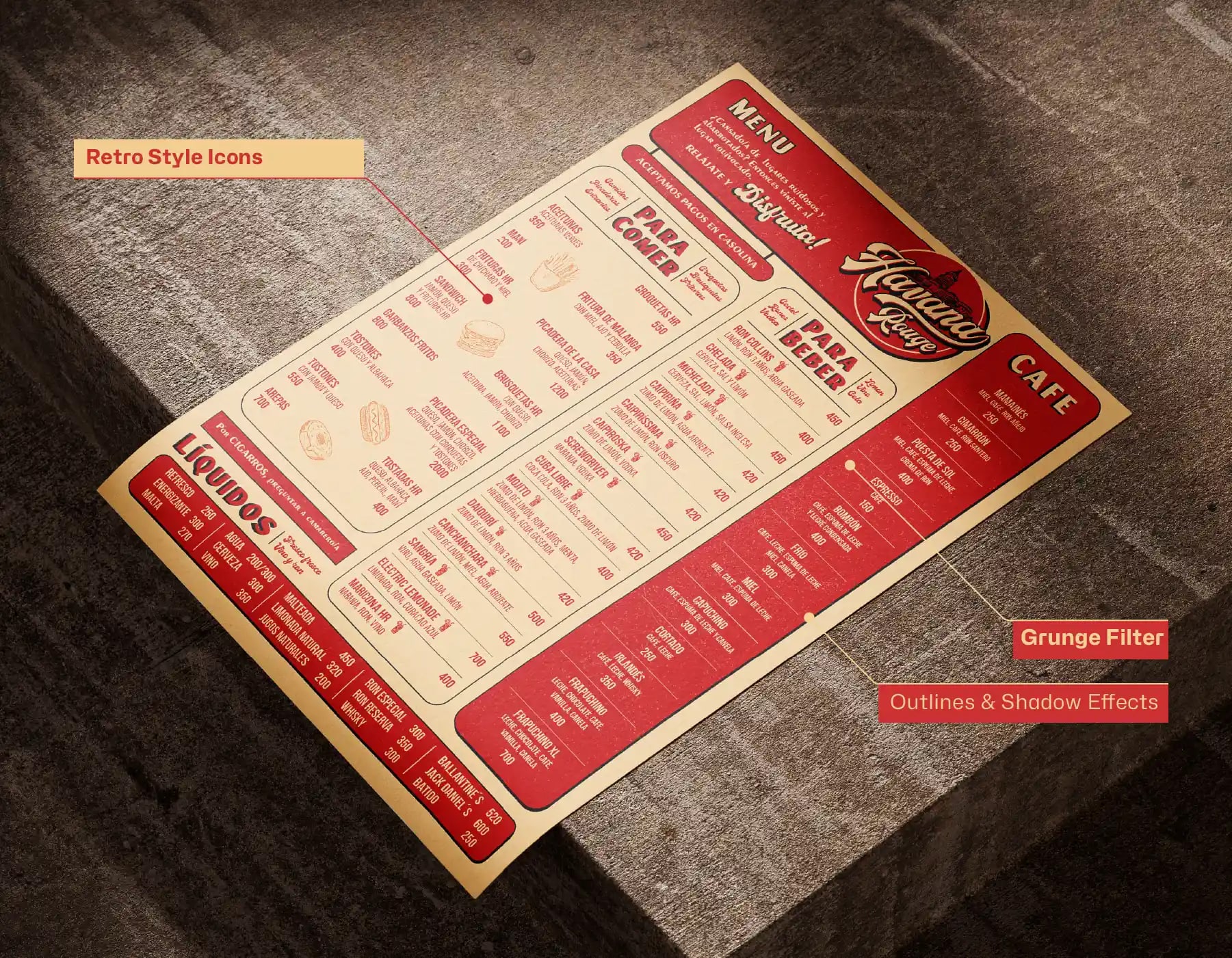
We approached the menu as an extension of the brand's visual language rather than a standalone document. The same principles that governed the posters and promotional materials — expressive typography, warm tropical palettes, and nostalgic graphic rhythms — were translated into an editorial system. Layout, spacing, and hierarchy were treated as storytelling devices that would guide the diner through the experience while reinforcing the restaurant's personality.
Design Solution
The menu design applied the established visual language through careful page layout, expressive typography, generous spacing, strong visual hierarchy, rich textures, vibrant colors, and curated graphic details. Every design decision followed the brand's retro tropical identity, ensuring consistency while enhancing both usability and the restaurant's personality. Type choices, paper texture, and color treatments were selected to immerse guests in the nostalgic atmosphere while keeping the information effortless to read.
Results & Impact
The result is a cohesive dining experience that aligns seamlessly with the broader brand world. The menu became a memorable touchpoint that reinforced the restaurant's identity at the table, turning a functional object into a brand artifact that guests noticed, enjoyed, and associated with the Havana Rouge experience.
Tools Used
- Adobe Illustrator
- Adobe Photoshop
- Adobe InDesign