Project Overview
Melito is a jam and fruit-based products brand built around a family legacy. The name is a tribute to the founder's father, giving the identity an emotional foundation that informs every decision — from tone of voice to material choices on the shelf.
Creative Challenge
The brand needed to communicate tradition, authenticity, freshness and product quality while clearly differentiating each fruit variety within a single, coherent family. The challenge was to honour the heritage behind the name without leaning nostalgic, and to make the range instantly readable at point of sale.
Strategy
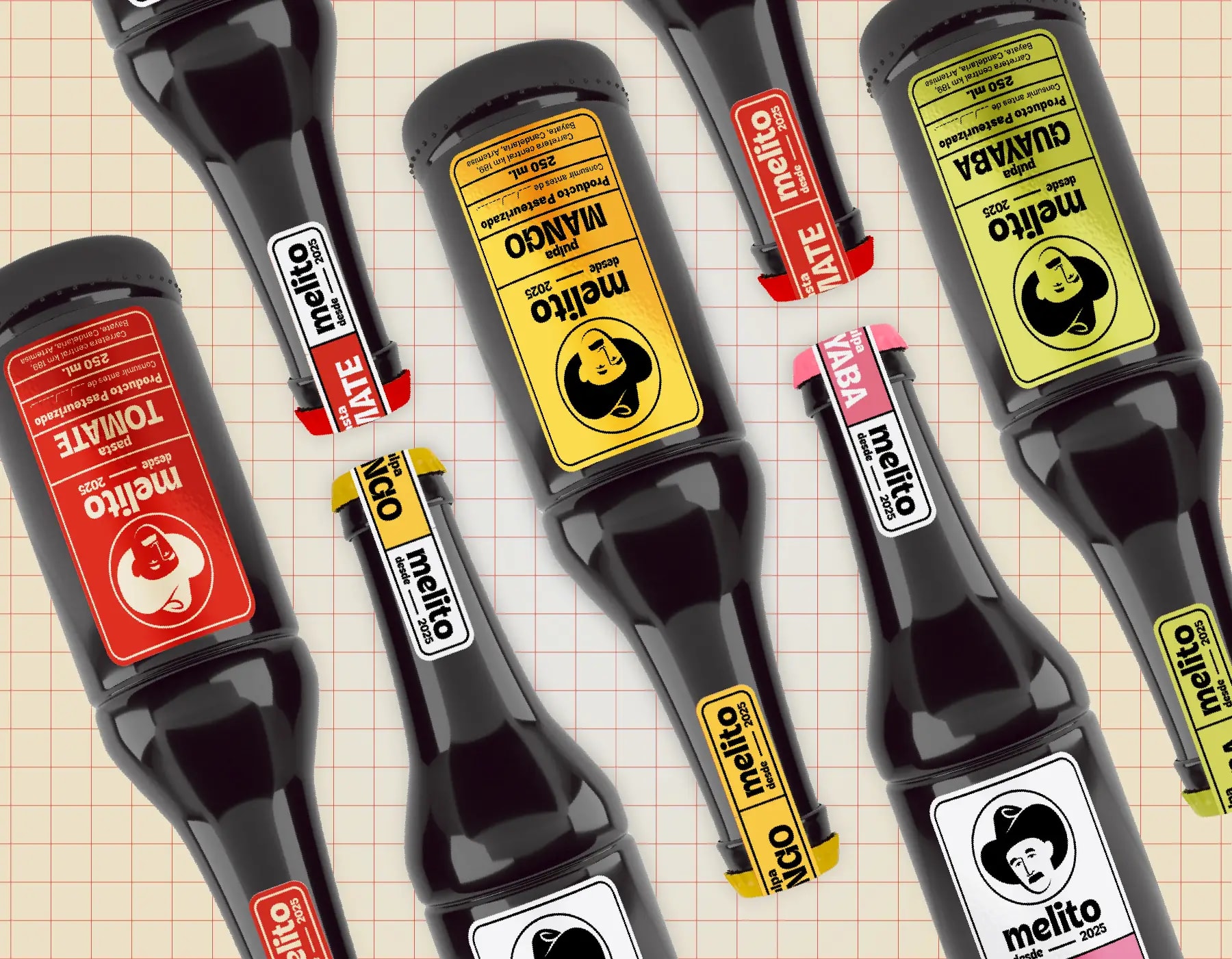
We treated Melito as a system in which heritage and freshness coexist. A fruit-inspired palette became the navigation layer of the range, letting each flavour own a color while the wordmark, typographic hierarchy and seal stay constant across the line.
Design Solution
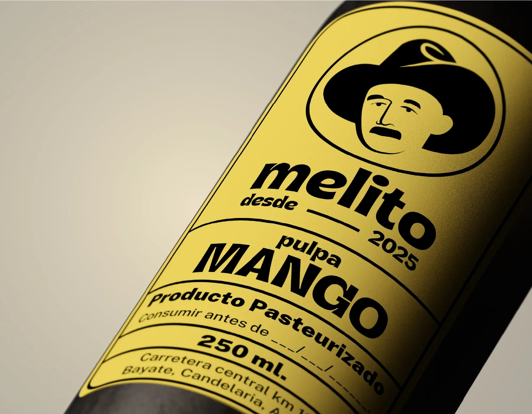
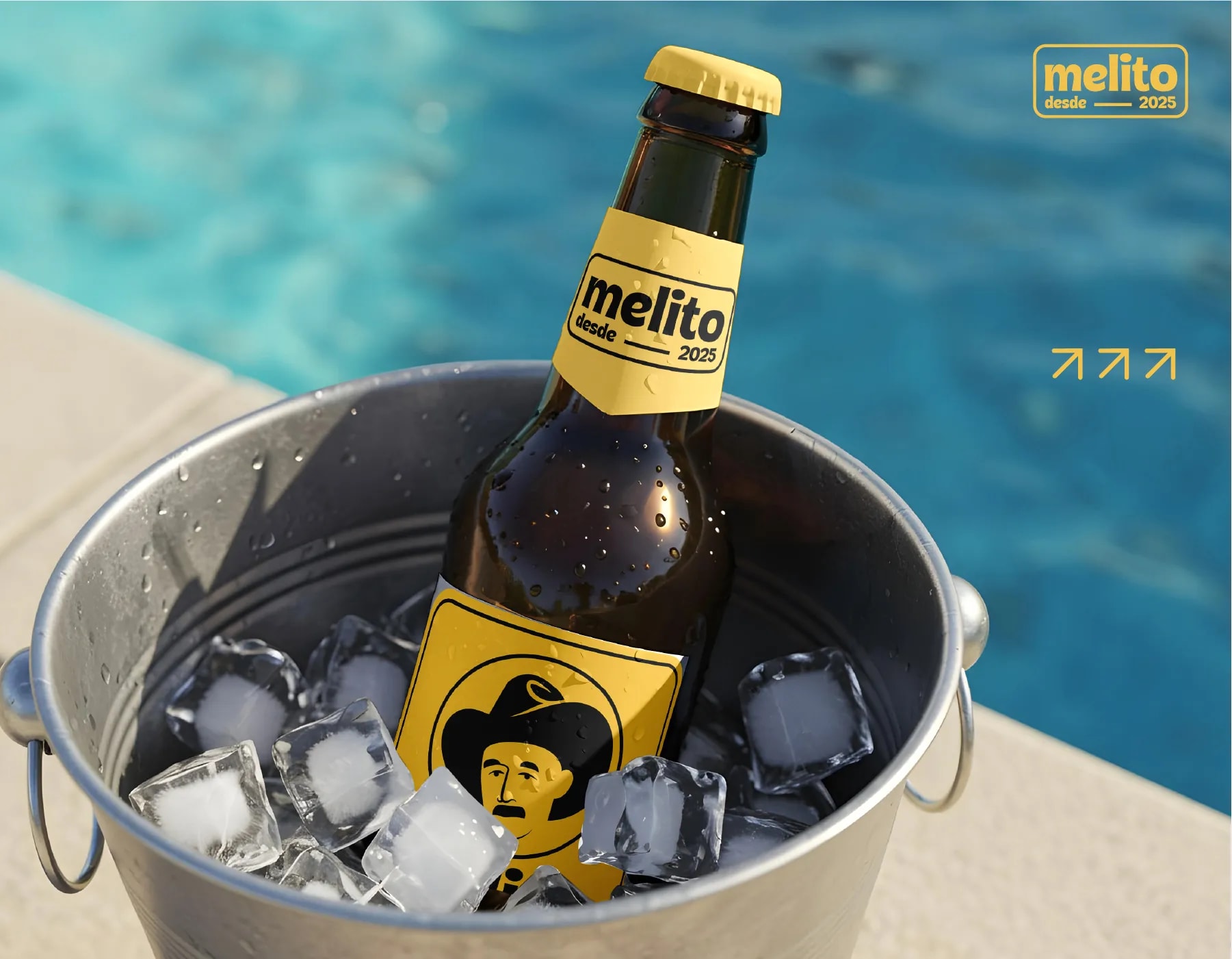
The project covered logo design, label design, a packaging system, a branded metal lid and a branded guarantee seal placed between the lid and the bottle neck. Together they turn the jar into a complete brand artefact rather than a labelled container.
Results & Impact
The outcome is a cohesive, scalable identity that pairs family heritage with a fresh, recognisable packaging experience — easy to extend to new flavours and formats without diluting the core idea.
Tools Used
- Adobe Illustrator
- Adobe Photoshop
- Figma